Beyond the color pickers
Andy, Thanks so much for picking up the topic of color pickers (pun intended).
I'd like to add to the topic by discussing cases when accuracy is not as important at results. In this case there's a problem of abundance of choice. You don't have time to quickly and correctly pick one from the 16777216 colors. Plus alpha value? Come on! Whenever you're confronted with a photoshop/gimp-like color picker you either choose random color, or single color that's globally predefined in a palette. I also understand that very few 'casual' users maintain own palettes for consistency.
What's worse, for subsequent choices of colors, the same difficulties repeat with various level or annoyance. I know advanced users sometimes add currently picked the color to a Custom Colors table of the color picker, but that's all. (Andy covered the color swatches topic, that's a clear improvement). The table as it's present in KDE apps and other apps, is global per your OS account, so context-less, as if it was designed in hurry. It comes from old Windows software, early 90's. The context is not even at application level, and obviously not related to the project you're working on. (BTW, this is why I think the story of KDE Activities would better start at (smart) apps level not at desktop level)
I'd like to mention there are other approaches. I mean especially themes, explained on my blog 3 years ago:
https://blogs.kde.org/2011/12/14/fruits-css2-shared-themes
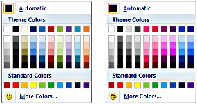
So the themes can address the problem of abundance of choice. In one go you can pick a color set, and application can use it to apply defaults to your document title, heading, maybe some background. Possibilities depend on what the content is for given application.
Second thing is live previews, something that benefits from the power of themes. Without them you pick a color without seeing the context. Picking your selection in a 10 pixels box is not the same as observing it temporarily applied to the destination area (filling an object's backgound, setting text color, etc.). So very the same blog mentions Document themes selector picking MS Office 2010 as an example:
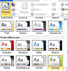
You try the selection by hovering your mouse pointer and you immediately see the live preview. As engineers and they say it's hard to implement. That shouldn't stop us. I believe such concept can play well with side context panels we have already documented in the HIG.
All that, naturally depends or application, but the usefulness is beyond of the color picking. One can imagine color theme for widget style can pick the colors (and paragraph settings, font settings, by the way) from the theme.
For all this to work, we need developers that are willing to apply the concept to their apps. And an organized effort to avoid dozens of app-defined, incompatible theme notations/definitions floating around. Ideally, the place of favourite theme(s) is the KDE system settings. For me that's not just a proposal without a follow up, Kexi will be applying it at one point.
Comments? Please share them on the VDG forum.