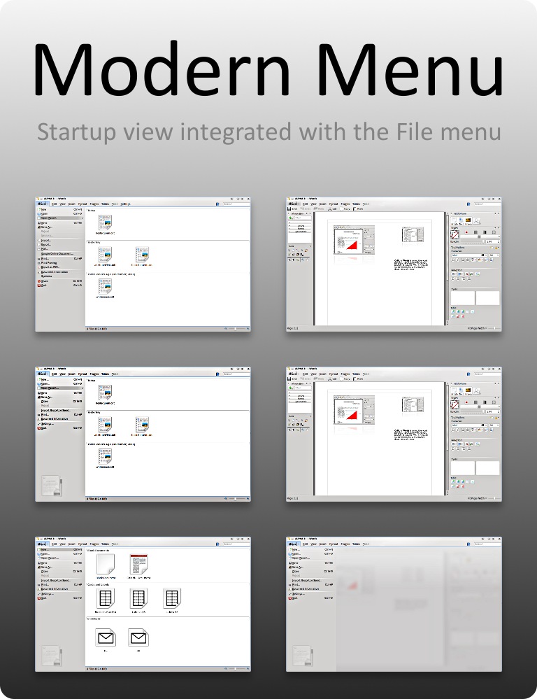
KDE 5 Menu
Note in bold: no official plans here, however many continuously maintained software projects start with N+1 version development long before N version is discontinued. So yes, I really think the current works at UX level are "the" KDE 5 development.
Transition to KDE 5, whatever it means, is a process not just one atomic step. Today a follow up of
the previous entry about fruits of the Calligra Sprint: Modern "File" menu merged with start-up view.
The need
The ideas were much older but it all started to take shape in January 2011. First, some analysis and mockups born.
While the mockups are prepared for document-oriented app, namely Calligra Words, the aim was to have something fitting for specialized apps like Kexi, where document is not the center of the application's work flow. You know such apps do exist, and you probably use them. Think of KDevelop as a notable example from the KDE world, and Eclipse or Qt Creator from another. For such apps it is typical that so-called Project is the center of the work flow, not a document, and there are multiple views (at least 5 in Kexi now, and 3 in KDevelop). Thus, the Project is term referred by the menu otherwise called "File" menu.
It is important to say that the topics covered here do not include the "Tabbed Toolbar" menu. Interestingly, the modern file menu concept is compatible both with the current classic menu bar used by document-oriented Calligra applications and with the "Tabbed Toolbar" menu used in Kexi 2.
All these notes show that talking about KDE 5 make some sense. We see increasingly more ideas like QML reuse and going with simplified UIs. Now there's more freedom of expression than ever. The target platforms differ each other more than ever, and the user base is diverse: something what needs to be addressed.

One of the mockups: Page displayed when user clicked "New..." command in Words.
The implementation
Within Calligra, the app that would benefit most from the flexible start-up and "File" menu is Kexi, so I proceeded with initial implementation for this app specifically. This means that the special "Kexi" button is merged with the Tabbed Toolbar rather than the conventional Qt menu bars.
![]()
Watch on YouTube (see also MPEG file)
One of the important differences between the ordinary QMenu with actions and the newly developed is that the latter uses no modal windows at all (instead it includes these windows as views) and itself it is not a popup. This way the user experience becomes closer to browser's UX. And by definition, less mouse clicks are needed.
Technically the main challenge was to force QMenu to be ordinary child QWidget. The original QMenu forces to be a separate window of popup style. I wanted the new menu to have mostly the same API as QMenu to reuse as much the KAction features as possible. At the moment it was not possible without a fork of qmenu.cpp (note: feel free to invest your time into improving it e.g. at Qt level, then I am here to help, otherwise any requests will not be very effective :) ).
Besides reusing of the the QMenu API, the main assumption also was to maintain the features like Accessibility, Right-to-Left, and have QStyle-independent solution (that would be hard without QStyle proxies).
The code is available in the Calligra repository, kexi-modern_menu-staniek branch. It is not yet clear if it makes its way to Calligra 2.4 or 3.0.
What we already have: the menu with so-called persistent selections, a place for displaying "views" like Templates List, and the "Kexi" button. Compared to the mockups we lack the search box (upper-right corner), which is independent task, and only the "New project" page is integrated.
In addition the Tabbed Toolbar has been uncluttered by removing extra lines from the QTabWidget-based implementation (again, largely thanks to the QStyle proxy). You can compare the effect by looking at the movie and Kexi's 2.3 menu.
Wrap up
Final reminder: Ideas are rarely 100% original, and art is built on stealing. But developments presented here are continuation of earlier works, not a cloning of some recent software. I recommend reading this post from 2006.
I demonstrated the working results at the Calligra Sprint. I was especially interested how the mockups were received at usability level; Anna-Lisa mentioned the modern menu idea (mockups) was received mostly well among the users taking part of her usability tests. Now it will be possible to also test the real interface and improve it.
Next time I will write about Qt-only strategy for some Calligra library code.
PS: Would you like to join us, the Kexi Project? Do not be shy, write to kexi@kde.org and start today :)
