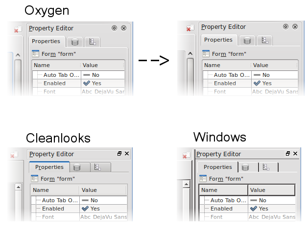
Elegance #4: tab bar uncluttered
In previous "elegance" entries I presented just ideas, without implementation. Readers obsessed in the area of look&feel may remember the proposal for uncluttering tab widget when used in side pane.
Any specific fix would be just for Oxygen style, so it is still unclear if starting to code this makes much sense. But. As a low-hanging fruit today I called this code on my tab widget of Kexi side pane:
tabWidget->setDocumentMode(true);
As for so cheap fix the result looks quite nice to me. Also presented result for two other styles. I think it's good hint for similar UIs. Also works with Qt-only apps.
