AUG
17
2010
|
Elegance #3: Opinions vs Data
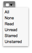
Follow up of the discussion about new UI elements: "it may look weird" first-look opinions vs positive results of usability testing. GMail has removed "select all/select none/..." buttons with single combo box for exactly one reason: elegance or UI uncluttering. How do you like it? Feel free to share your comments below after a few days (preferably using the UI e.g. in gmail). |
![]() |
Comments
smart UI concept
I've already been using it today, and I don't think it's weird at all.
It's easy to understand what it does, even if you haven't seen anything like it before.
And it does indeed contribute to an elegant, uncluttered UI.
Among other things, it uses a very sensible concept that's also used in Microsoft's Ribbon UI:
The concept of not just listing all available actions of a certain action group side-by-side in a uniform way, but promoting certain "default actions" or "most important actions" that are easier to discover and easier to reach than the rest of the actions of the group, without spatially separating them from the others - so that things that belongs together still remain close to each other.
This is imo much more intuitive than the old-fashioned menu+toolbar layout, where a set of menus lists all available actions in a uniform way, and a separate toolbar list the "most important actions", but each one totally separated from similar "not so important actions" which one would naturally expect to belong together (which however the user will have to tediously look for in the menus instead).
I wish KDE apps would be a bit more courageous regarding such new UI experiments, rather than leaving it to others to impress with innovative UI concepts and then copying them later on once they have entered the mainstream...
experimentation?
Ever seen Amarok, bangarang, Plasma? Don't tell me there ain't a lot going on in the new-UI-department in KDE.
Meanwhile you are right in that the default setup of menu+toolbar is very deeply build into the KDE framework and something hard to tamper with - thus you see few attempts to do that.
And those who try to experiment (eg reKonq) are attacked for not following the GUI guidelines.
Frankly I'm unsure about the issue myself, I like consistency but there might be better ways to present such things in the UI and to find them you have to experiment...
Maybe even I have had enough experiments since the 4.0 release and would love to see things settle down JUST a tiny bit...
I don't use Amarok or
I don't use Amarok or bangarang. But you're right about Plasma, it's really very innovative (and also well-designed) UI-wise, in fact that is what makes it so awesome. I wouldn't mind if all KDE apps would become a little bit more plasma-like... :-)