Elegant (!) way to have them both
Do you remember the tabbed toolbar thing that was once born in Kexi? It's an attempt to optimize the UI when collection of actions depends on context. This part of development goes well, even while there is no framework for use by other KDE 4 apps. Those still use the KDE 3 technology, i.e. KXMLGUI leading to rather big menus.
What's understandable many users prefer to use menus, and even more of them would ideally use both toolbars and menus. Certain actions are hard to express using icon or icon+short name.
Read on to see a proposal to have both of the worlds.
Only few out there probably know that Zoho office has a fresh concept. Here's normal tabbed-toolbar-like interface:

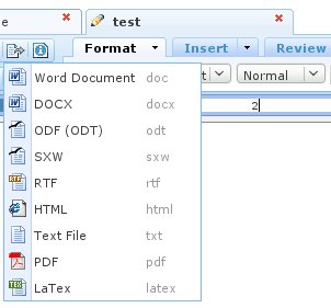
Now the interesting - the same interface provides menu. Just click the arrow:

If you ask me, it's simple and can work. It's possible to add shortcuts and keyboard navigation goodness.
Here's more explanation: google PL->EN translation. Let's hear what you think in the comments!