Fixes, features
Many small fixes are a building block of the Kexi porting effort - the goal is joining the KOffice 2.2. Many of the fixes and refactoring is related to forms. Much more left and we're scheduling works on crazy features even up to Kexi 2.6 already.
The next is porting task, I hope, is the table view port to QScrollArea from QScrollView, what's rather demanding task to me at least since while the table view can be called widget itself, it is the biggest one (# of SLOC) of those I have touched directly so far in KDE (at least it bundles a dedicated model/view framework developed long before the first announcement of Qt4 Model View API).
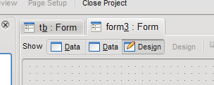
Sometimes one needs to add some procrastination, and this time I added an indicator/emblem-like icon to forms so you can easily notice that what widgets are bound to data source (and to which).
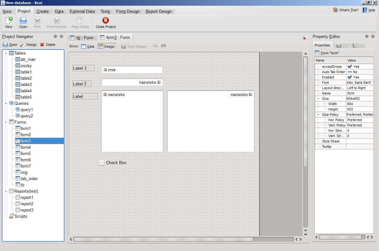
Kexi Forms: Data source emblems for data-aware widgets; click to enlarge
Other small improvement that you can find in above screenshot is frame-around-labels in the design view. Before that, we had to live with borderless labels, like in Designer. As Kexi generally lowers barriers for new users, we display the frame more like in case of a text frame in a word processor.
In related news, I am also excited that Nuno has admitted that one of the forthcoming items on his list are Oxygen icons specific to Kexi.
Speaking of procrastination, we (me and Nuno and Hugo Pereira) just yesterday had a small session of three graphics-loving guys regarding some bits of Oxygen style. Two outcomes of that are:
- Idea for cleaning up vertical lines for the case when docks+tabwidget+splitter+another frame is used in an application. This is the case for Kexi as well everywhere in KOffice and most complex apps featuring sidebars. I bet the idea is not new and the improvement is pretty much demanded. Two proposals (less and more extreme):
 (compare these improvements with the current look presented earlier.
- Exclusive QGroupButton styling for Oxygen; my early proposals, need fixes but the 3rd is somewhat acceptable. The mockups use Kexi's view switchers as a base.

On the technical side, I think the look can be either set default or can be supported via K* overload of QGroupButton or addition to KStyle or by setting a Qt4's dynamic property (so developer can decide to alter the look only for some group buttons). Whatever we recommend, it could find its way to the HIGs first.
There's also one note that we agree on, that since the Oxygen now employs fade in-out when you switch between tabs in QTabWidget, this effect should be measured and switched off when there are too many delays. The goal is not only to support slower machines or conserve power but also cases when there are large Konqueror's (or Kexi's, which is indeed my test case) tab areas much harder to fade in-out than small ones. So there could be some logic employed depending on the size of the tab widget.