Kexi Quickies
A post on the KDE forum motivated me to write some info about what's new with Kexi 2.0. For sanity I groupped a set of quickies as an 2.0 Alpha 12 changelog. For uninformed, most applications within KOffice will meet the stable 2.0 release (already passed a promising RC1 stage), while Kexi and Kivio neds more time for development. The hope is to synchronize nicely at the 2.1 stage.
![]() "The main highlights behind Alpha 12 is a completely new Report Designer, and Property Editor, both based on new Qt 4's facilities. Report Designer is a creative fork of OpenRPT libraries, and already makes up a rich reporting tool that well integrates with Kexi principles. Property Editor is a component used by any designer in Kexi, i.e. currently Table, Query, Form, Report and Script Designer. The new quality of the Property Editor will hopefully improve user experience.
"The main highlights behind Alpha 12 is a completely new Report Designer, and Property Editor, both based on new Qt 4's facilities. Report Designer is a creative fork of OpenRPT libraries, and already makes up a rich reporting tool that well integrates with Kexi principles. Property Editor is a component used by any designer in Kexi, i.e. currently Table, Query, Form, Report and Script Designer. The new quality of the Property Editor will hopefully improve user experience.
As a true Free and Open Source Software project, Kexi has enjoyed more new developments such as Oracle and ODBC drivers." (more)
Reports
Report Designer (features) is a huge and original contribution by Adam Pigg, who is now undoubtedly the most active developer on board. On the final feature list of Kexi 2 stable, reports will be probably the only bigger feature that can be considered new, when compared to Kexi 1.x.
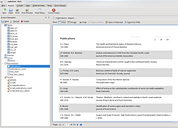
Report Designer demonstrating multi-record-per page, page numbering, and in-place preview features (KDE 4 on Linux) - click to enlarge
You can also compare how the "Publications" report presented above looks after exporting to HTML (link).
And finally, "Publications" report in the design mode:
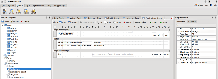
Visual design mode of the Report Designer (KDE 4 on Linux) - click to enlarge
Forms
Forms have started to work again about February, after quite huge refactoring stage. I am now close to fulfilling the promise that there will be no unneeded abstraction layer that allows to embed the Forms Designer within 3rd-party applications (there were attempts to do so in KDE3's KDevelop and there was a standalone KFormDesigner in KDE 3, mostly a main window on top of the framework). Currently, less abstractions leads to simpler code, even if some other kind of abstraction will go when we'll want to share e.gour redo/undo command classes between forms and reports. Qt Designer's code is LGPL now, so people willing to embed its property editor have more chances than we had in Kexi had, in about 2003.
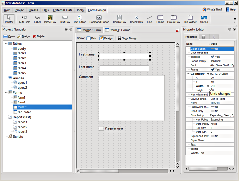
Kexi Forms (Oxygen Style, Windows) - click to enlarge
Property Editor
During development of the new property editor and the abstract property framework "KoProperty2", I have encountered a number of places where some new ideas can be applied or just the code refactored. As an example of small functional changes, a new "revert" button appeared that undoes changes made to a single property. In KoProperty1 (Kexi 1.x) and Qt Designer appears on the right hand of the property value, in KoProperty2 appears on the right hand of the property name.
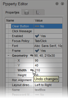
Property Editor 2 with "revert" actions exposed
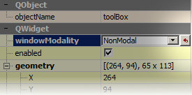
Qt Designer's property editor with "revert" button
This lets us avoid issues when the editor is getting narrower because of the undo button, what is the case of Qt Designer's property editor. Moreover, the new way of displaying if the button is visually similar to how "clear" action is displayed in KLineEdit, so I hope you'll like it.
Widgets palette
Widgets palette went temporarily to a custom tabbed menu's tab (see the Form Designer's screen shot above), but it is possible that the palette will find its way within a context side bar. Whether it will be the left hand (used also by Project Navigator now) or the right hand (used by the Property Pane) -- is not a closed question. Perhaps there are more points in favor of the first option, because the Property Pane is usually used in parallel with the widgets palette -- if so, then it is better to provide a way for having both visible.
The third, easiest to implement -- and typically not too much thought out -- option is the current temporary Widgets tab. It takes a lot of space: vertical space is too small to fit even all the standard widgets we have now; and I did not even count actions for form designing, such as tab order setting, layouts, alignment... (see the screnshot again). If these went to an Edit tab, we would have (again) a problem with users forced to switch between two tabs too frequently.
Tabbed toolbar
I am BTW also somehow interested on how (and where) will the Korat UI go; looking forward to see possibilities of reusing it for Kexi. Well, "interested" is one thing, but it is also easy to get excited about one thing: how common in FOSS it is to discover that an independent development started for a feature you have put on your TODO stack months before :)
Currently for Kexi we are using rather simple QTabWidget, and just adding some dynamism from time to time in an evolutionary way, as there are still more urgent TODO items than the main window.