Tabbed, Context-Aware Application's Workspace
There's enough of meat committed to SVN so it's time to show you something those involved in Kexi have been waiting for: tabbed and context-sensitive style of application workspace. It honours Fitts' Law-friendly-KDE 4's-large-toolbar mode, while still is aimed at tools accessible for power user and development environments like Kexi.
Tabs
A switch from 1.x to 2.x series of the KOffice suite appears to be significant jump in technology. I hope users will also notice actively changing look and feel of the particular applications. In case of Kexi 2.0 -- it already differs very much from the previous series, to accept new challenges. The main visible change is absence of main menu. To rock in more areas, Kexi 2.0 needed a way for grouping global commands. A construction currently called Tabbed Toolbar allows that now.
As you may recall, I have had some fun showing the idea of grouping actions using tabs is not MS' invention. It's rather best known from Borland tools. What I proposed after weeks of development if a mix of tabbed toolbars and local toolbars, so there is clear separation between global action and context-dependent stuff.
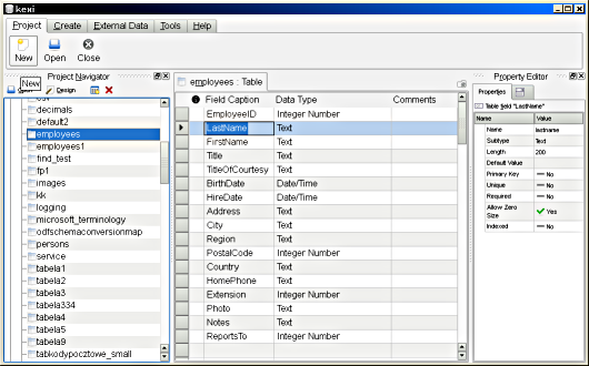
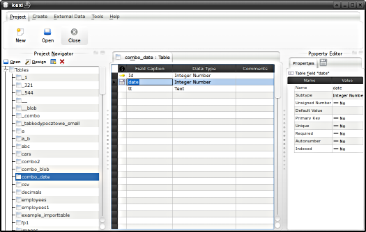
Kexi 2.0 ~alpha 2: Tabbed Toolbar under MS Windows/KDE4, Plastik widget style (click to enlarge)
First, I'll give you example why groups visually distinctive could be usable. In Kexi 1.x there is "Project->Import->Table Data From File" action. So, the action itself (QAction::text()) is called "Table Data From File". Not very informative, as soon as you use such actions out of context. On the other hand changing this to "Project->Import->Import Table Data From File" could make the submenu chain bloated. So instead in 1.x I've been using tooltips to store reasonable full name (here it would be "Import Table Data From File").
In 2.x with toolbar groups, the action could look as presented below:
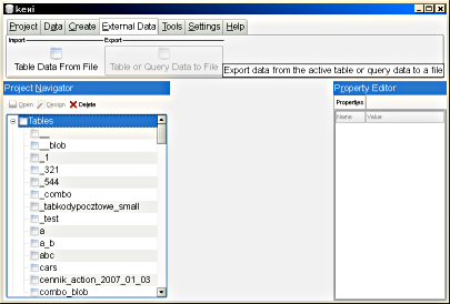
Example way of presenting action groups (click to enlarge)
Of course there is one actions per group now, but this way we can add more import types still saving expensive screen space.
In addition, tabbed toolbars can work with extensions -- including those delivered by plugins -- where we did not know how the traditional set of toolbars would look like with all those new actions. Custom actions can be merged in the new GUI, and hiding groups of actions is smoother and more obvious. Using so-called User Mode, where most of editing actions are visible during the whole application's session, the applications created on top of Kexi will look so simple that it will be easy to confuse it for a C++ app written from scratch.
One night Aaron suggested tabs could have set up an auto switching on mouse over after about 0.5 second-long delay. Now you can see this feature on the following screencast:
Dealing With Context
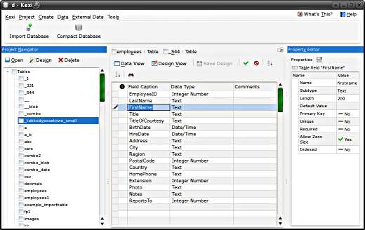
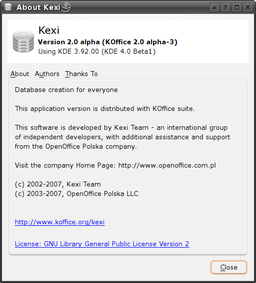
Fast forward to Kexi 2.0 alpha 3: the new Oxygen style makes tabs and panes look differently.
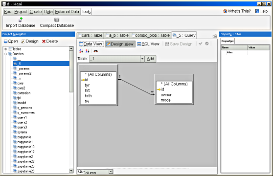
The Kexi's 2.0 main window solution, still being subject for extensions, context in which you're working is honoured. For example, Kexi 1.x provided views where you can switch between Design View, Data View, and sometimes Text View (e.g. for entering SQL query statements). At the time, a group of two or three toggle buttons implementing the switch were placed on the main toolbar.

Kexi 1.x: view mode switches and editing actions were mixed with global actions
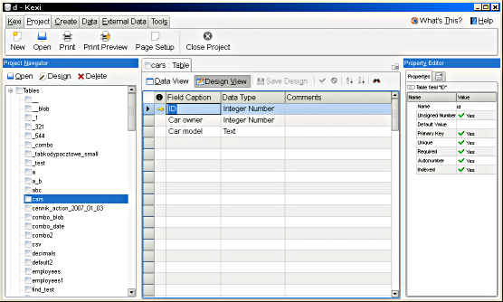
Because this frequently used action group was not about any global change, the buttons are now placed within the window's tab pane itself they belong to. Note: do not confuse toolbar tabs with main workspace area's tabs containing windows.

Kexi 2.x: Introduction of local toolbars: view mode switches and editing actions are moved down to individual windows.
I am convinced that this change gives:
- better context sensitivity,
- uncluttered main toolbar,
- faster and more flicker-less GUI, independent of XMLGUI tricks with switching clients,
- it's possible to add a "Detach Window" feature (what rocks for multihead display systems) and still there will be no need to duplicate many of the main window actions - all context-dependent actions will be still local to the detached window and glued to it,
- you don't need to move your mouse too far - local actions are placed locally
Actions like "Save/Cancel Row Changes", "Sort", and in the future - advanced combo boxes for data filtering - all this is now placed within a given window. Visually means that these buttons are often multiplied if you have opened many windows, but the action model is shared of course.
(I'll tell that you personally I like more the way how the tabbed toolbar looked like with original Oxygen style - presented on the very first picture. Hope that contrast and focus hints in the new version will be finally better)
Moreover, windows that have no idea about text mode at all (i.e. anything but the Query Designer), simply do not show "Switch to text mode" button now. These special designers have in turn many actions unique to them. How this looked like in Kexi 1.x main window? A number of buttons or menu actions, most of the time grayed-out.
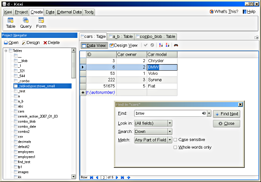
Summing up, the new iteration of Kexi follows quickly changing context and supports task-based interaction. It's nicely visible when you look at "Create" tab (see picture below) that has been put in place of old "Insert" menu. In theory it was not clear at the time why Insert does not contain "Insert row" action. Now actions related to rows (records) can be grouped in "Data" tab and local toolbar.
And the very last, a typical session with many windows opened and "Kexi" toolbar's tab.
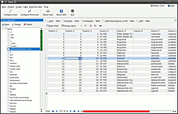
Kexi 2.0 ~alpha 3: "Kexi" tab of tabbed toolbar, under Linux/KDE4 (click to enlarge)
This is my current proposal for place, a bit inspired by similar menu in Mac OS X. I simply needed a way to remove "Help" tab because "Help Contents" and "What's this" actions have been moved to upper-right area for better discoverability. To answer how do you like it, you may want to try the interface on your own.
(Links to images updated on 9th Feb 2015)
