KDE to sue MS over Ribbon GUI?
Sometimes I like such challenging questions (who cares? journalists are sometimes more extreme). Let's look a bit closer at "new" MS's Riboon GUI. If you just want to know who can be sued, and by who, simply jump to the last section of this entry and save some your time.
Here we will talk about Ribbon[tm], menu+toolbar replacement (screenshots for informative purposes only):
Figure 1: MS Access 2k6 (aka "12") - click to enlarge
Look at the screenshot. Seriously speaking, I'll not complain that the MSA Team went the same way as apps like Kexi, e.g.:
- tabbed interface: first used in browsers like Mozilla, then in KDE KMDI - IDEAl mode
- "Project navigator" sidebar on the left hand instead of floating "Database window", as in Kexi
- row color altering, as in every KDE's list view
I will also not discuss about elementary problems with the Ribbon GUI such as these two obvious:
- Why so much space is wasted? It may be good thing for LCD market, yeah? But certainly not for users.
- Why so much average user's knowledge and muscle memory is wasted? I still do not believe there will not be an option to switch menus on in the final "MSO 12".
Reason? Their MS Visual Studio 2k5 already depends on menus, not ribbons in its "MSVS 2k5 Office integration" features (which is something like, say, ability for inserting KOffice parts into KDevelop).
Even if the Ribbon remains the only GUI mode for MS Office 2k6, hmm... there's solution: OpenOffice.org is here for users to help with this problem, and KOffice is not going to be worse with its planned Kids Office:
Figure 2: A mockup of KDE's Kids Office. Click to enlarge.

Instead, I'd like to ask: why there is a need for making the GUI specifically for retarded folks, and why to keep such thing as default? Did they plan to beat GNOME or Apple folks in this department? If so, well, congrats, well done. What's next? Development environments for dogs and cats?
Let's see:
1. Ribbon: a funky graphics applied to older idea.
First, if you're using GUI apps more than 4 years, chances are, you will notice the whole Ribbon GUI stuff has already been extensively used. Tabbed toolbars in two apps come to my mind after hearing all these oohs and wooows (IIRC, even among some KDE devs):
- Allaire's HomeSite app for web designers (now from Macromedia)
Figure 3: Notice tabbed toolbar on the top with "Quick Tab / Fonts / Tables.." tabs. Click to enlarge. - Borland's Delphi

Figure 4: Notice tabbed toolbar on the top. Click to enlarge.
Note that the apps above are aimed at power users. Hence the Ribbon-like GUI was usable: these users typically want a quick access to more options than an average user. I think the Ribbon still means a bloat for the latter guy.
Here could be a problem: MS apps are generally bloated after so many "forced upgrade" cycles every two or three years. And yes, "no bloat" could mean death for MS (one less reason to upgrade for customers), so they decided to hide their bloat into tabs. Some magic to make shareholders happy.
2. "Redmond, we have a problem": Ribbon in power users' apps?
I am convinced MSA guys used above sentence at least once during the development. We, devs, all know there are no universal solutions for making GUIs nice for anybody. Ribbon makes heavy use of icons and addd only a bit of text. Last I've checked, people can read text. Apple, with all its simple GUIs, keeps menus, for these not-so-dumb users, and by default, presents icons only for most frequently used actions. MS did quite conversely.
2.1. Let's focus on MS Access as an example power user's tool. Let's don't pretend Joe User will drop Excel because MS Access has now much larger icons :). No. It's powerfull tool that requires certain knowledge. SO, in MS Access you have a large number of actions usually described with pretty complex verbs, not nouns. Too bad: nouns can be a lot easier presented with graphics, not verbs. Look:
Figure 5: MS Access - typical "power user" actions for dealing with external data
Notice how many "table-like" icons there are on the ribbon. It is not easy to invent an easy to recognise icon for "saved imports" or "collect and update". The authors decided to put verbs like "get" or "collect" as toolbar names (ribon sections), while on the figure 1 you can see that toolbar names use nouns (tables/reports/forms). Consistency? Not quite. OTOH, a few believe, it's just a matter of year or two and users' muscle memory will be retrained... but before that gazzilions of $$$ will be wasted globally just because of these issues.
2.2. Related problem: there are many similar actions that just share very similar icons. Since there's no menu, and there's no text, how the user can quickly distingush one action from another?
Look at the figure 1 on the beginning of this article. There are about 8 table-like icons (e.g. table/table templates/share point lists). So the authors, being aware of the problem, needed to add some text below all such icons. More space used. More bloat (compared to menus). An here's one more problem: the text is small, decreasing accessibility. Try to increase the font and the Ribbon will hide important actions from your eyes (so go and buy a 30" display). Or just explode.
A power user can read text commands and she/he also likes to be sure the command she/he is invoking is what she/he was looking for. Thus, I guess Ribbon metaphore is not going to work well in power user's app.
3. Who need to be sued, and by who?
Ahh, simply, nobody. But Linux and KDE in particular took advantage of Ribbon idea in a lot more thoughtful way. Enter the Potato Guy!
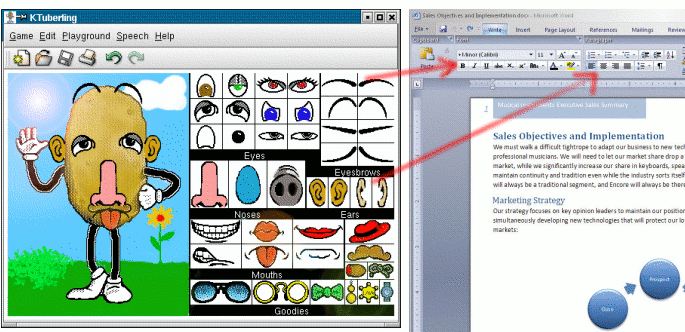
Figure 6: Some of us believe MS Office 12 GUI has its roots in KTuberling's "Potato Guy" interface ;)
Summing up... I would rather think twice before starting to copy Ribbon GUI for an KDE app. If it's a simple app, sure, we can give it a try. But please leave an option to switch back to menus (hmm, but then for which GUI version will you prepare user's documentation?).
(Links to images updated on 9th Feb 2015)